


PLEASE WAIT to be SEATED
Peter Mahler Sørensen of Danish furniture and lighting brand PWTBS talks shop in this exclusive no holds barred interview

“WILL THIS BE SOMETHING WE PASS ON TO OUR CHILDREN?”
That’s the bold premise behind the approach of Danish furniture and lighting brand PLEASE WAIT to be SEATED.
Founded by Thomas Ibsen and Peter Mahler Sørensen less than ten years ago, it could be argued that PWTBS have already succeeded in leaving their mark on posterity.
With a catalogue filled with unique products, playful designs and distinctive colours, the brand serves as a strong reminder that furniture and lighting can transform everyday experiences into eventful, joyous occasions.
During a recent tour of Berlin architects to present some of the company’s latest products, PWTBS’s Peter Mahler Sørensen was gracious enough to let me throw questions at him for an extended period of time.
In this interview, we talk brand, products, materials, and design in general.
Enjoy.
Peter, let’s start with that name: How did you come up with the name PWTBS?
When the brand started many years ago, we already had several great ideas in development, and all we needed was a name.
At some point, we saw one of those signs you see when you enter restaurants: "Please Wait To Be Seated".
It’s one of those consistent things you see all over the world. And it seemed like a catchy name. And that was that.
How do you decide which designers to work with?
The very essence of our approach revolves around collaboration with international designers.
Some of our designers approached us with innovative designs.
Fräg Woodall was one of them. He approached us with the Bondi chair, which was named after the place where he designed the chair at his home, in Bondi Beach, Australia.
And in other cases, we approached designers because we liked their work. The Hardie Stool by Phillipe Malouin is one such example.
He created the stool originally for an exhibition by Kvadrat. The stool was initially fully covered in textile, even the legs and foot rests. And we could totally imagine the design within our collection.
Some of our designers, such as Faye Toogood and All the way to Paris, have been long time collaborators. Their design language has become interwoven into the PWTBS spirit, and we love them for that.
From the name of the company to the products themselves, there’s an underlying element of humour which permeates the collection. For a furniture brand, that’s quite refreshing. Was this intentional?
Perhaps unconsciously.
We set out to produce exceptional furniture and lighting. But we didn’t want that to come at the expense of being seen as too Scandinavian. So we try not to take ourselves too seriously.
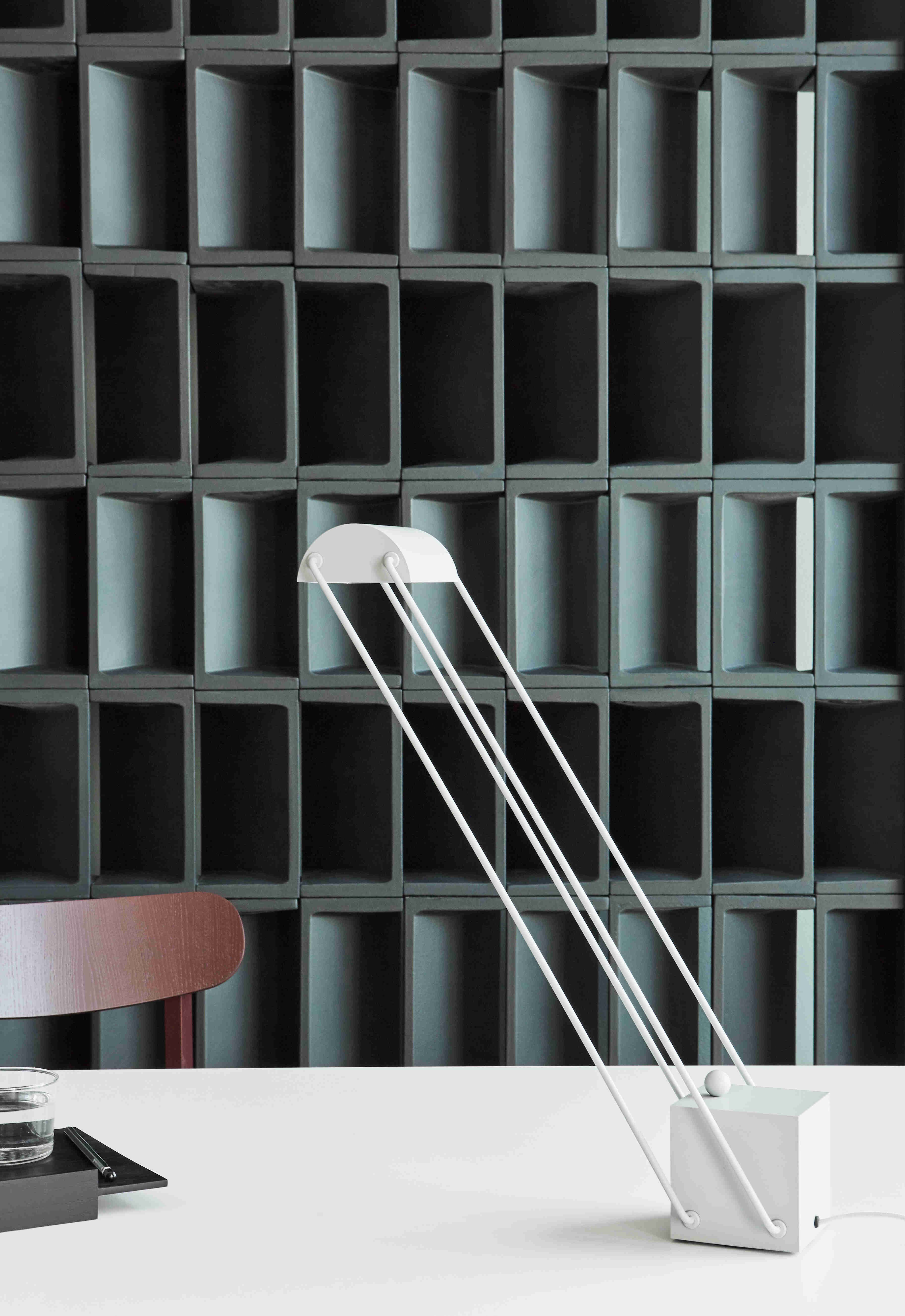
For example, the name PWTBS itself might lead you to expect that our first product was a chair. In actual fact, our first product was a light!
This sense of humour carries through our entire catalogue, from the slightly overweight proportions of the Tubby series from Faye Toogood, to the Keystone lounge chairs by OS & OOS.
Injecting a sense of humour into the products hopefully translates to the way the end users see and use our products. I think that’s a very powerful tool to create a memorable impression for a design brand.
The brand’s unique colour palette gets a lot of positive attention. How did this signature colour palette come about - and why is it limited to eight colours?
We wanted to create a defining characteristic for the identity of the brand. And that was our set of eight distinctive colours.
These colours have been with us since the launch, and have continued to remain a consistent branding element ever since.
The colours reappear throughout the catalogue. They’re beautiful on their own, and when combined, they produce some memorable colour combinations.
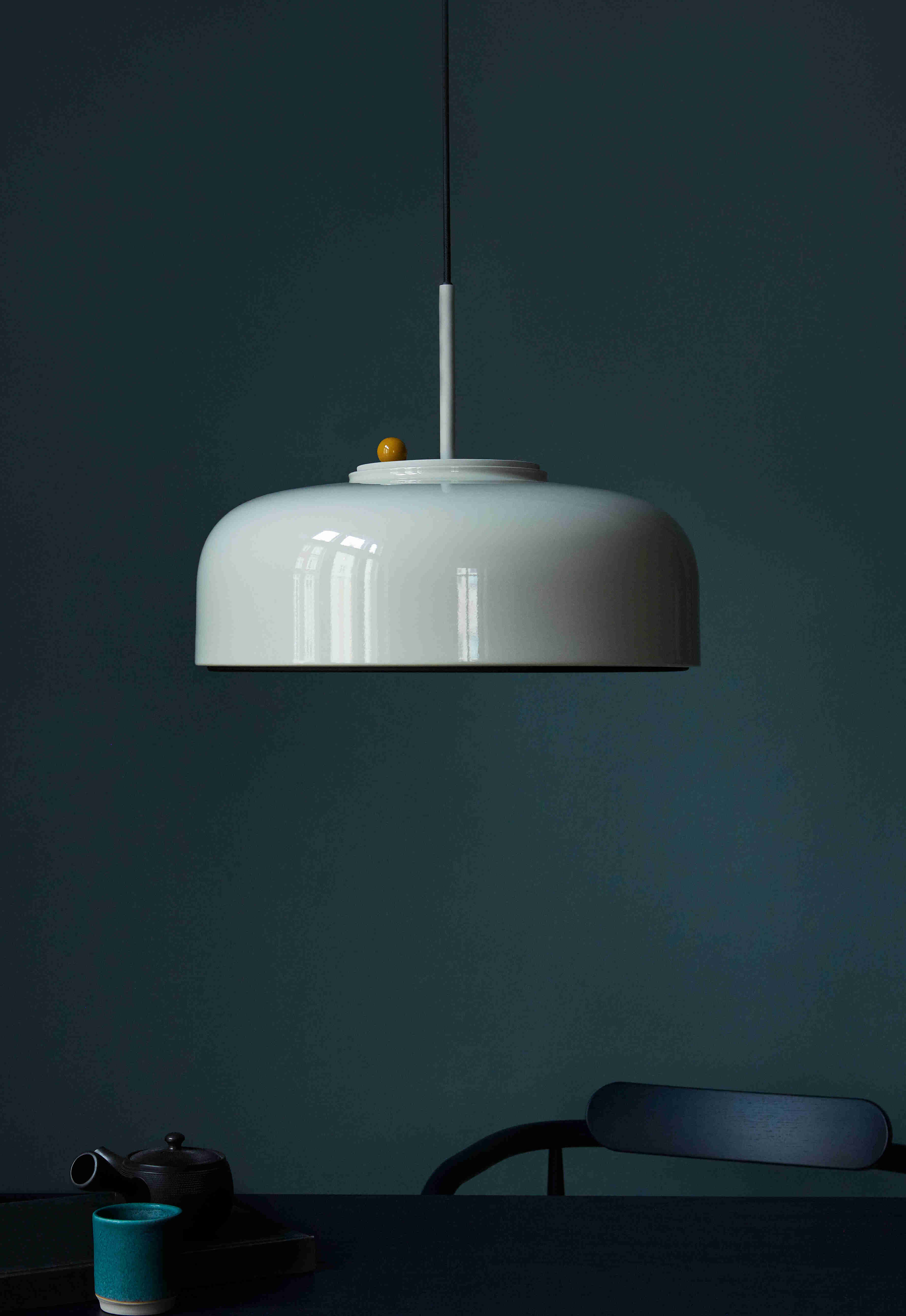
You can see these combinations in various products, like the Podgy lamp with its contrasting body and dimmer.
The contrasting colour combinations of the Bondi or Maiden chairs work really well together. Colour has definitely helped us gain attention with architects throughout the globe.
In fact, we’re now introducing another colour for some products. Our upcoming BEAK mirror (Søren Rose), will also be available in Ivory. The Ivory has a lot of white and a hint of yellow, and it’s a very nice extension to the PWTBS colour palette.
A lot of the PWTBS products have a sculptural quality to them. Where do you draw the line between sculpturality and functionality?
It comes down to that age old question: can something useless be truly beautiful?
We encourage the questioning of traditional ideas of functionality in furniture.
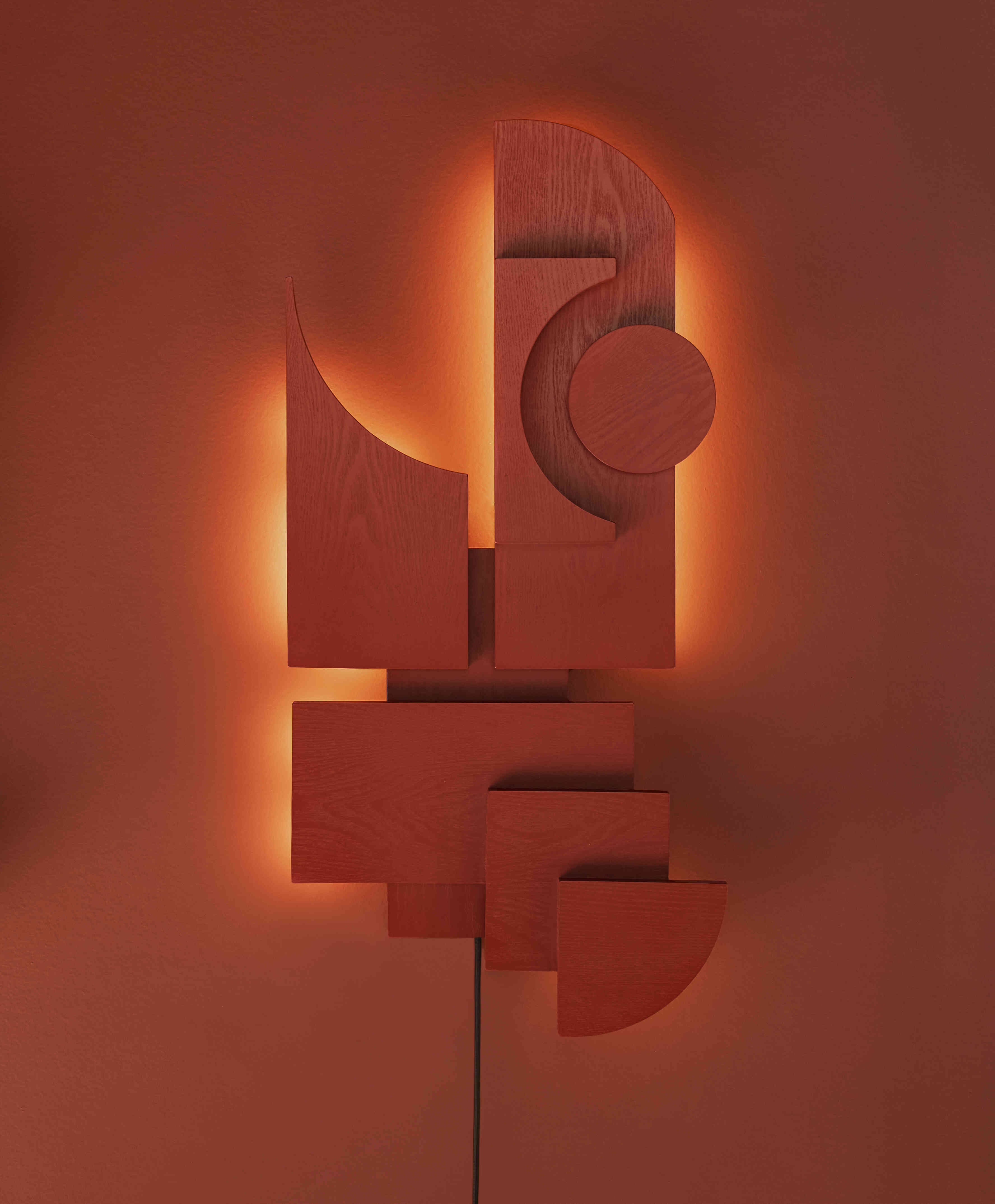
The Totem wall luminaire, for example, is an absolute sculptural piece. The rotational dimmer is also integrated within the piece, and it provides subtle ambient lighting with a unique form.
The Spade chair by Faye Toogood is another example. It's half chair, half spade, half something else, and its androgynous functionally always sparks conversations.
Maybe for this reason, the product is very polarising. And surely that’s a good thing? Although it’s not very popular in Denmark, it’s big in Japan!
Apropos Japan: there’s a lot of Japanese design influence throughout the catalogue. Has Japanese design influenced the creative direction of the PWTBS catalogue?
Japan and Denmark might be geographically disparate, but it’s well documented that there’s a cultural crossover between both countries, especially with regards to design.
Personally, I love rediscovering hidden gems from Japanese design history. The Tokio Lamp, designed by Shigeaki Asahara in 1980, is a prime example.
Originally produced by Stilnovo, It was out of production for decades. So we collaborated with the designer himself to relaunch it as part of our PWTBS collection.
Although vintage examples of the Tokio lamp exchange hands for well over 1500€, our re-released version can be enjoyed at a more affordable price point - and with improved functionality, may I add.
The Anzu seating series is another example of our penchant for Japanese design. It’s a testament to the shared traditions of Denmark and Japanese design.
Several PWTBS products successfully - and respectfully - turn tradition on its head. Was this a conscious move?
We embrace unconventional uses of furniture.
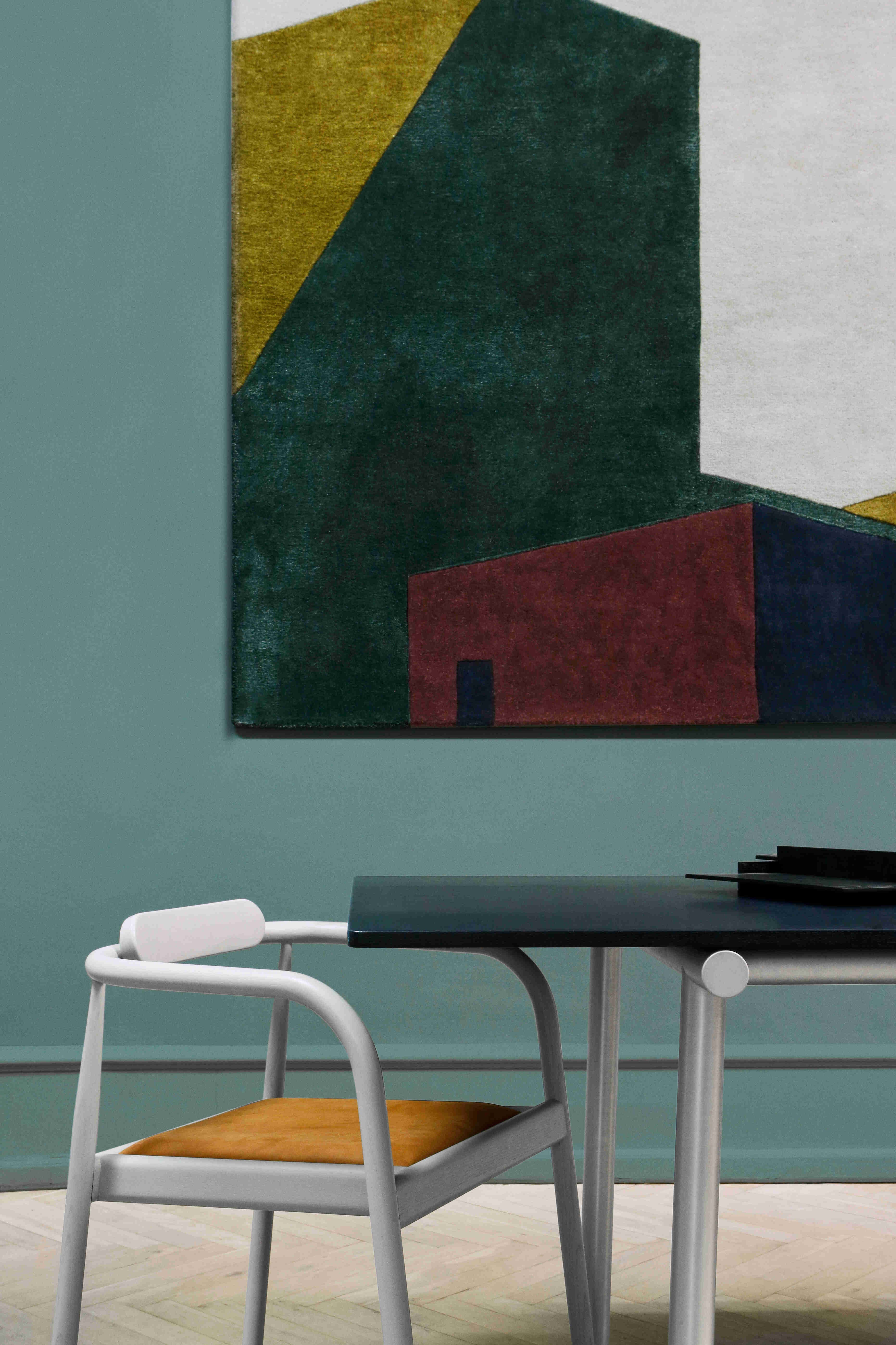
For example, the most obvious use of a rug is to put it on the floor. But hanging them on walls is much more interesting.
Hanging carpets on walls was a practice I remember my parents doing in Denmark in the 70s and 80s.
They probably did it so that their carpets wouldn’t get dirty, but in the end, they looked fantastic on the wall.
That’s where the reasoning for our Arqui Rugs comes from.
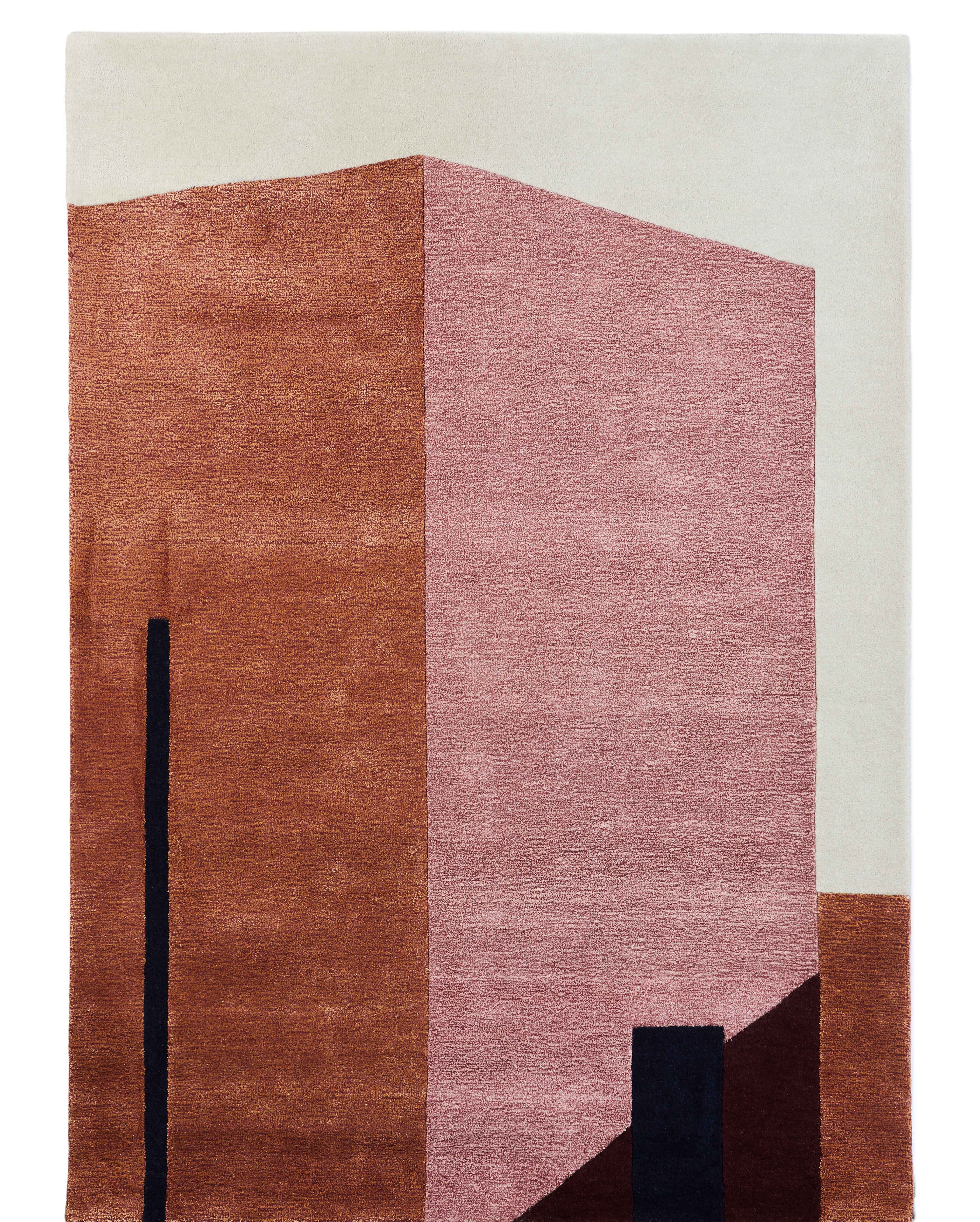
The abstract designs of New Mexico building silhouettes with their mixture of colour, light and shadow deserve to be seen on walls as pieces of art.
Their dual viscose/wool material combination also adds an interesting visual texture that you might also see when looking at oil paintings.
So this is definitely a tool that we like to encourage our users to play with.
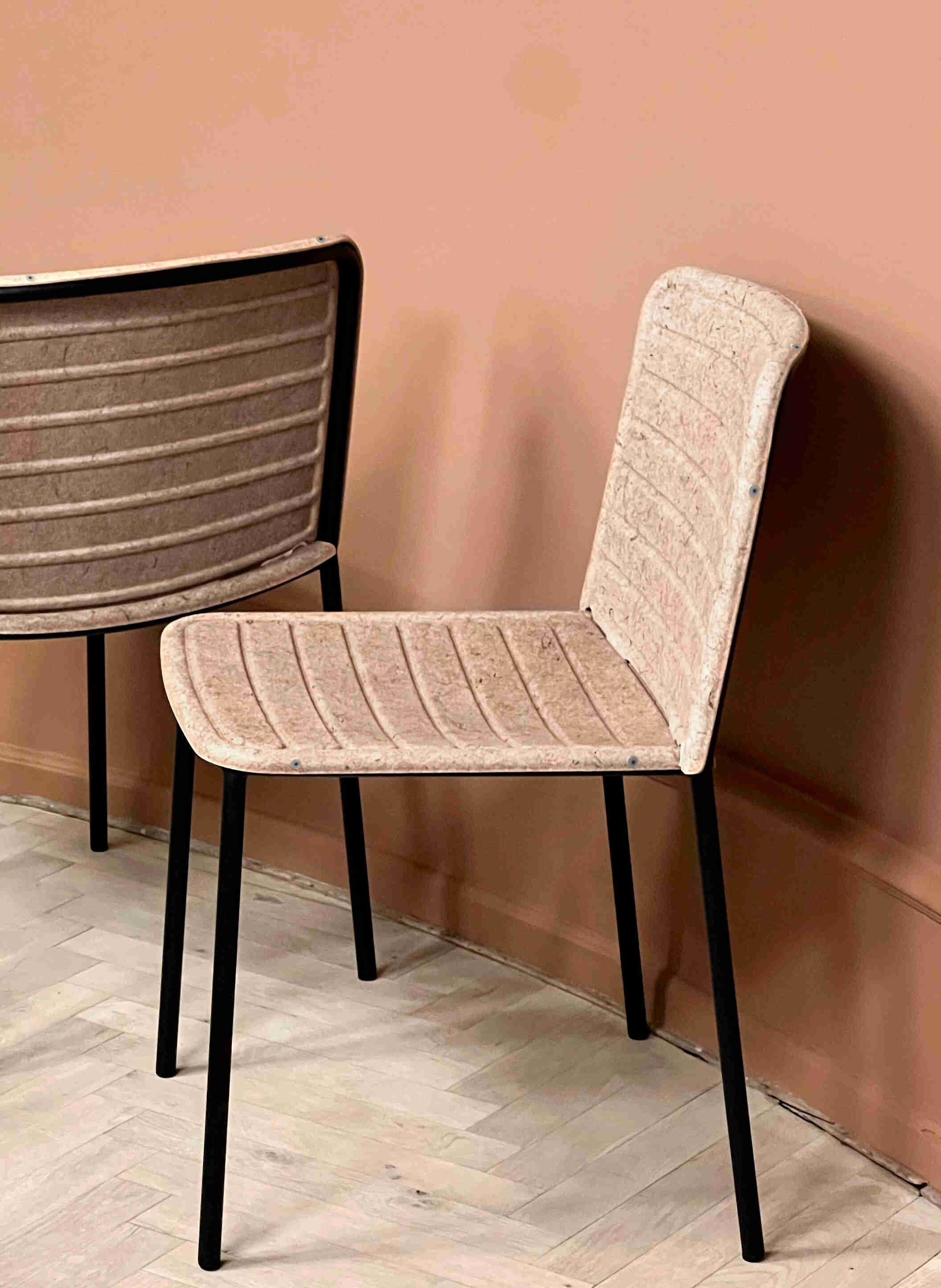
Flax Stacker: this new chair is unapologetic about its plant based make-up. How has this been received?
There’s obviously a big push at the minute to use recycled materials in furniture design.
Mostly, however, recycled materials in furniture design are made to look like conventional materials. That’s certainly not the case with the Flax stacker.
Flax wears its material with pride. It’s quite obviously a natural material - compressed flax grown in northern France. It has a wonderful texture, and it invites you to touch its surface. And for that reason it generates a lot of attention.
Flax itself is something of a Wundermaterial. It’s a plant which grows quickly, so once harvested it can be replenished.
Once compressed into its form, flax regulates heat brilliantly. You can sit on it in summer without getting hot, and in winter without feeling cold. It’s also light, which makes the chair easy to move around and stack.
We want to push the aesthetic possibilities of sustainability, so Flax certainly feels like the start of something exciting.
And finally, what’s your favourite PWTBS product?
I’m biased obviously, but I like all of them!
Now that I think of it, I really appreciate some lesser known products such as the Mimesis mirror (ATWTP) and the Crofton Stool (Daniel Schofield).
They fly under the radar, and maybe for that reason they’re cool.
Visit the PWTBS website here. PWTBS Products can be seen and tested at smow Berlin