Why Colour is More Important Than Form
Deepdiving into the world of colour as seen through the lens of one of its key advocates: the late Danish master of design, Verner Panton
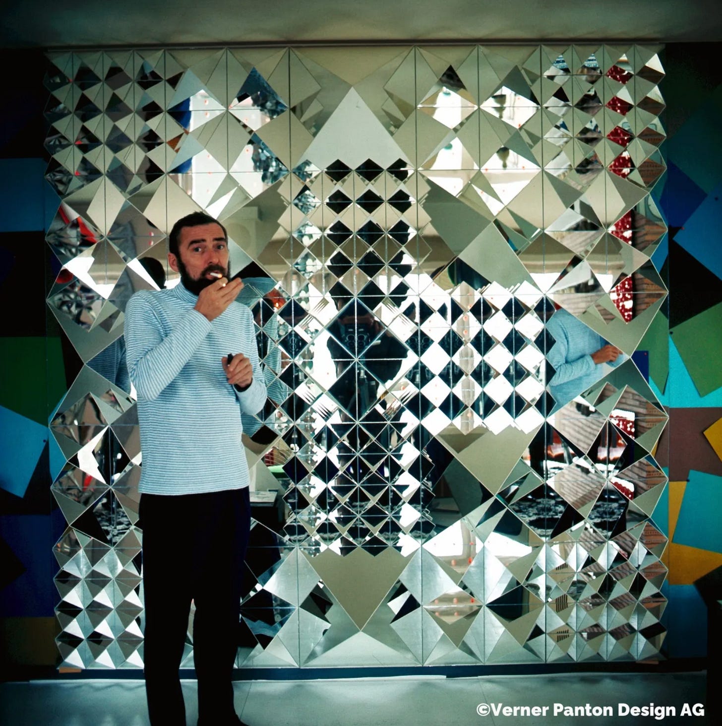
In his 1997 book Lidt om Farver/Notes on Colour, Verner Panton famously remarked that colour was more important than form. It’s a predictably bold statement from the designer who brought us futuristic design classics such as the Flowerpot and the iconic Panton chair, not to mention countless colourful “Gesamtkunstwerke” such as the Spiegel Kantine or the Visiona II installation.
Take any of Panton’s iconic designs from the period, however, and one thing is acutely clear: the bold, abstract and often unusual forms of his designs are equally as revolutionary as his employment of colour.
It could even be argued that many of Panton’s most infamous product designs still manage to feel contemporary precisely because of their unique forms, which often employed ground-breaking production methods and materials.
So, given Panton’s obvious attachment to both colour and form, why did he claim that colour was more important than form, and why does his lasting reputation still carry such a heavy colour-bias?
Building on milestones in colour theory such as Goethe’s colour wheel and Kandinsky’s ‘On the spiritual in art’, Panton was able to weave the psychological power of colour into his designs to create alluring and tantalisingly memorable experiences.
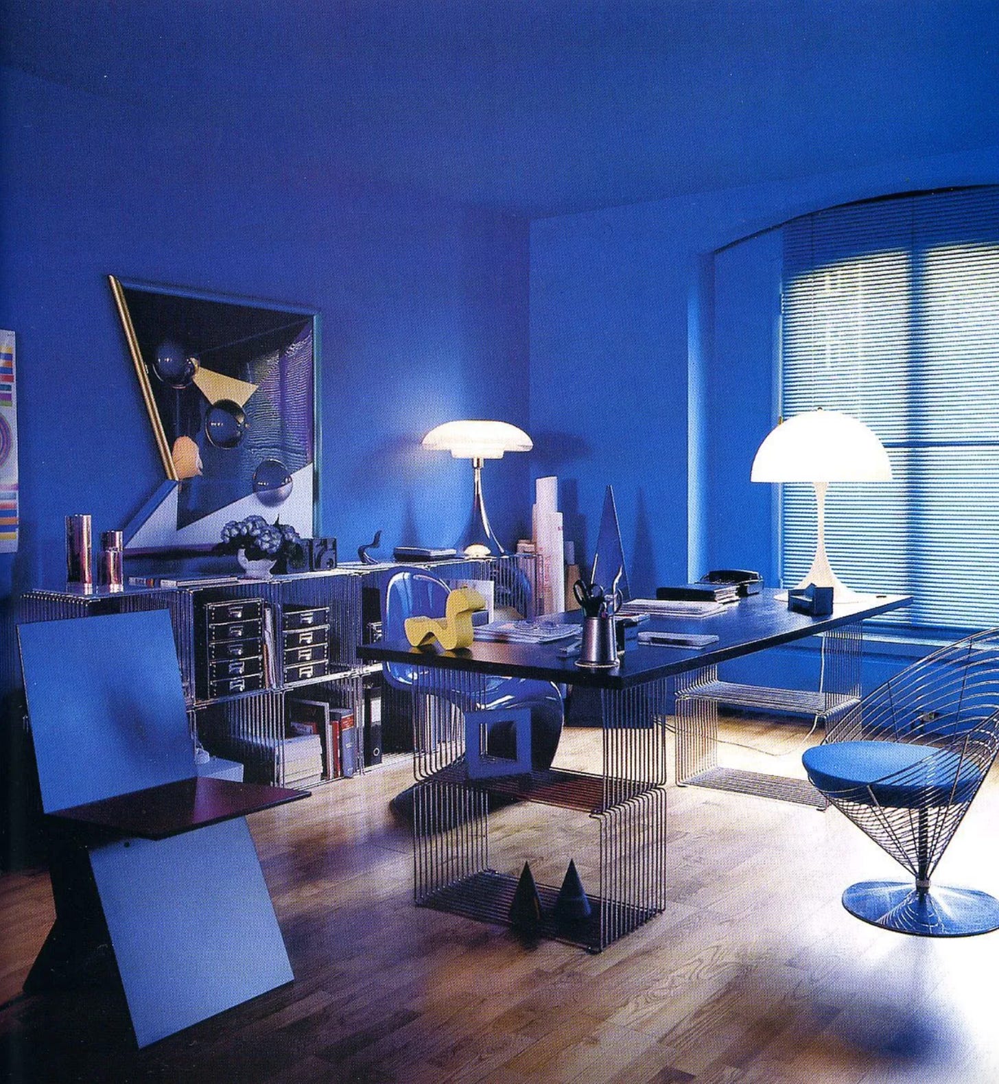
According to the man himself, colours were imbued with emotive signifiers. Applying green to a product, for example, could engender an atmosphere of calm, while red could stir up feelings of intense passion and energy. Blue, on the other hand, could give an impression of relaxed sensitivity, but also of love, femininity, calmness, depth and purity.
Surprisingly, there is actually some science to back up Panton’s claims. In his own research into psychology, he was able to deduce that bright, poppy primary and secondary colours could directly stimulate the brain’s limbic system, the part of the brain which deals with emotions and subjective reactions.
Panton’s research was spot on. Scientists now understand that visual information first passes through the brain’s limbic emotional receptors before being processed by the cognitive parts of the brain such as the neocortex — which are coincidentally responsible for shape and pattern recognition. In purely cognitive terms, then, it would appear that colour would indeed appear to come before form.
The proof is in the pudding, as they say. When we see photos of Panton’s installations, or indeed encounter Panton products in the flesh, our attention is initially engulfed by the vivacity of his deliciously picked colours at hand.
That ‘wow’ factor in many of Panton’s installations is achieved, initially at least, by the emotive rush of wavelengths of visible light being interpreted as delicious colour by our brains
Although you could argue that the true extent of Panton’s brilliance is unveiled only when looking through the double lens of both colour and form, it’s difficult to shake off the overwhelming power of colour in Panton’s work.
Whether we like it or not, our brains are intrinsically wired to react in an emotional way to colour. Panton, a master of design, but also a master of understanding the complexities of the human psyche, exploited this to maximum effect. For this reason, in the world of Panton, you really do sit better on a colour you like.
Thanks to Verner Panton Design AG for the kind use of photos.
Please click the ❤️ button on this post so more people can discover it on Substack. Tell me what you think in the comments


